8. Comparing Samples
In this chapter, we will show how to use R to compare two phylogenetic profiles using pairwise comparison, compare two or more types of environments using an anova analysis, compare multiple profiles using clustering and principal component analysis, and identify determinants functions and nodes that distinguish between two or more samples.
8.2. Principal component analysis
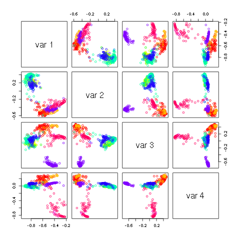
Principal component analysis is a common method to gain a broad understanding of how samples relate to one another. Starting with the human microbiome data from s.sets, we normalize the data with the commands:
hs <- apply(hmb$data,2,sum) # Hdat <- HmB raw data
Hnorm <- hmb$data/matrix(hs,dim(hmb$data)[1],dim(hmb$data)[2],byrow=T) #normalizing data -> all the columns sum to 1
HD <- sqrt(t(Hnorm))
HE <- eigen(t(HD) %*% HD)
H <- HD %*% HE$vector

nnn <- substr(rownames(H),1,4)
n1 <- unique(nnn)
v1 <- rainbow(length(n1))
names(v1) <- n1

pairs(H[,1:3],col=v1[nnn],xlim=c(-.9,.8),ylim=c(-.9,.8))
produces the following image.
to identify representative samples from the first two principal components, type:
plot(H[,2],H[,1],col=v1[nnn],pch=19)
legend(0.35,-0.2,n1,col=v1,pch=20)
identify(H[,2],H[,1])
8.3. Ploting significant differences between two profiles
If we select samples 351 (subgingival plaque 8) and 235 (cheek 27) as reflective of the difference between cheek and plaque, the difference in phylogenetic profiles can be viewed by:
jnk=hmb
jnk$data[,1]=Hnorm[,351]-Hnorm[,235]
Plot.profile(jnk,1,"n0000",tip.frq=25,use.edge.length=T,type="phylo")
producing
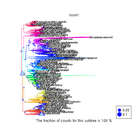
where upward triangles reflect phylogenetic categories more prevalent in the plaque than on the cheek.
8.4. ANalysis Of VAriance
In this example, we analyze the 547 human microbiome. Of interest is to determine what distinguishs the sample types from one another, and what constitutes ‘normal’ variation within a sample type. To answer this question, we perform an analysis of variance for each node:
Hstab=asin(sqrt(Hnorm))   #stabilize the variances
cavity=factor(nnn)        #label the sample types
anova.cavity=lapply( apply( Hstab, 1, FUN=function(y,v) lm(y~v), v=cavity ), FUN=anova )   # perform the analysis
Pval      <- sapply( anova.cavity, FUN=function(x) x[1,5] )                                # assess the significance
We note that the anova analysis is readily extended to comparing more than two types of metagenomic samples.
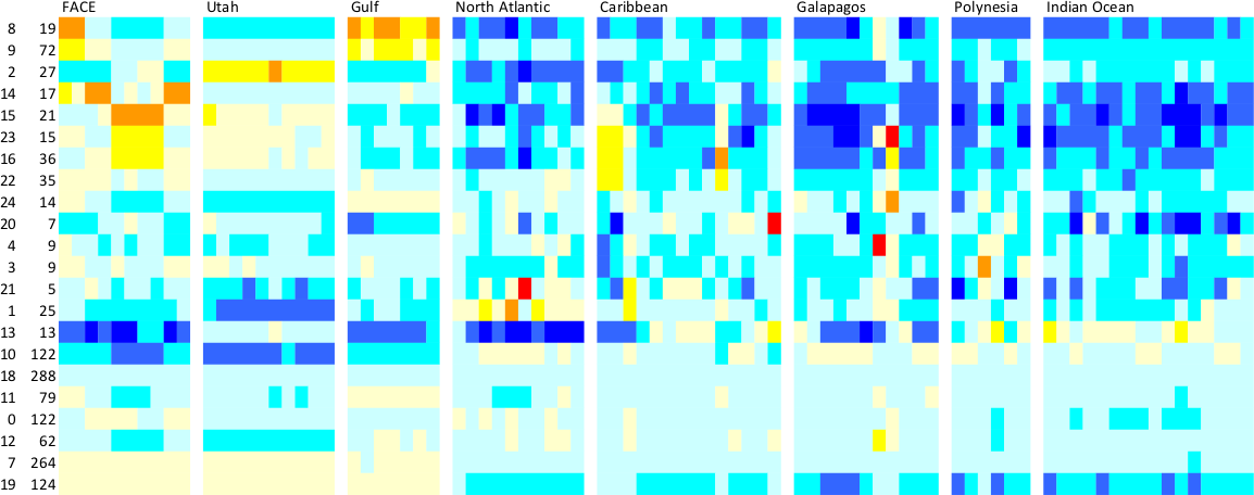
So far, we have shown what type of signal we are able to extract from the phylogenetic profiles. A question of equal interest is to quantify the noise in the profiles over repeated sampling. We have acquired ten samples soil bacterial samples in the Utah desert near Moab, five from sandy soils and five from shale. The samples have been taken at various distances apart, ranging from a few centimeters to tens of meters, to hundreds of meters.
From 16S surveys, we know that phylogenetic profiles of soil metagenomes show variations above and beyond sampling variability. Here, we will show how to quantify sample-to-sample variability. Such quantification are important when seeking to make inferences about the profiles.
We can use a chi-square goodness of fit test, to test for the uniformity of the proportion of reads recruited at a given node.::
# get data
data3 <- data.phylo[,48:52]
data4 <- data.phylo[,53:57]

ChiSq <- function(x){
   n.x <- length(x)
   zz  <- sum((x - mean(x))^2/mean(x))
   return(zz)
}

chi.sand  <- apply(data3,1,FUN=ChiSq)
chi.shale <- apply( data4,1,FUN=ChiSq)

boxplot( list(sand=chi.sand[!is.na(chi.sand)], shale=chi.shale[!is.na(chi.shale)]),log="y")
abline(h=qchisq(0.99,4),lwd=3,col=2)
The boxplot shows that at most nodes, the assumption of homogeneity across the replication does not hold. That is, the variations in the profiles at nearby locations exceeds simple sampling variability. To investigate the dependence of that extra variation on the nodes, we can plot the chi square statistics in sands and shale.::
plot(chi.sand,chi.shale,xlab="sand",ylab="shale",pch=20,log="xy")
abline(c(0,1))
We see that nodes that have larger sample-to-sample variations in sands also tend to have larger sample-to-sample variations in shale. We can visualize which nodes have the largest sample to sample variation (say in sandy soils).::
siz <- 2*sqrt(chi.sand/max(chi.sand,na.rm=T))
library("ape")
source("plotOnPhylo.r")
tree <- PlotOnTree(siz,1,20)
This display indicates that the root node is the most variable. Why? Furthermore, we can zoom into the branch that shows a string of relatively large variability to see if it is a poorly sampled region of the tree of life.
8.5. Clustering multiple profiles with R
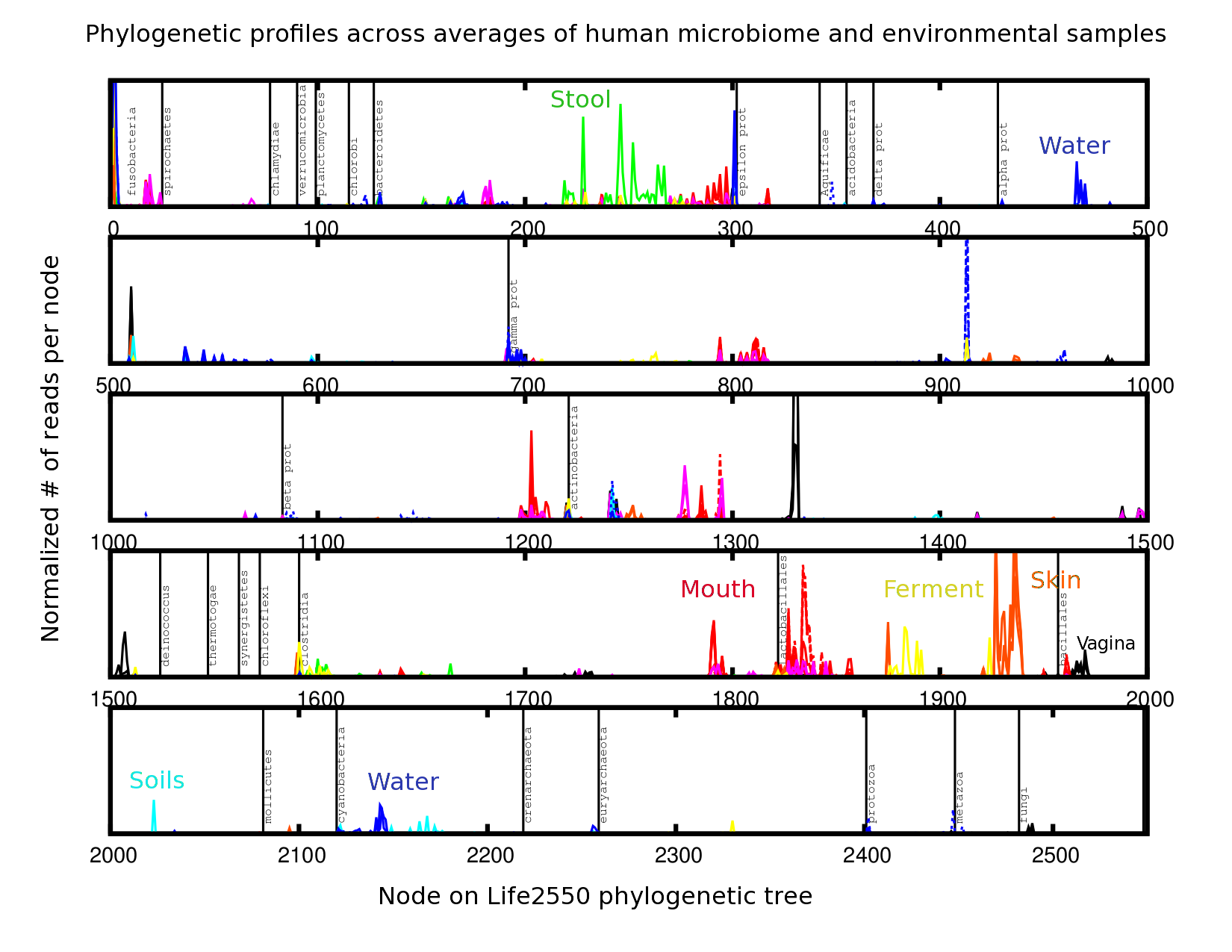
Multiple phylogenetic profiles can be grouped for similarities using k-means clustering. We demonstrate this type of analysis on all the phylogenetic profiles simultaneously. This provides an opportunity to investigate the hypothesis that metagenomes from similar environments have similar phylogenetic profiles. Our clustering analysis is done in several steps.
We start by transforming each profile into a probability distribution, taking the square root to stabilize the variance, and approximatively center each node::
#  normalize each column and take a square root transform
#  and remove columns with small counts

D <- dim(data.phylo)
n <- apply(data.phylo,2,sum)
keep <- n > 40000
N <- matrix(n[ keep ],D[1],sum( keep ),byrow=T)
profile.phylo <- sqrt(data.phylo[, keep ]/N)
mprofile.phylo <- matrix(apply(profile.phylo^2,1,mean),D[1],D[2])
rprofile.phylo <- profile.phylo - sqrt(mprofile.phylo)
The k-means clustering uses a random starting value for the cluster centers. As a result, each time k-means is used, a different solution is found. To ensure reproducibility, we set the random seed and sort the clusters in decreasing size.::
set.seed(9111)
#  number of cluster
n.cluster <- 18
kmr.phylo <- kmeans(t(rprofile.phylo),n.cluster)

# sort clusters in decerasing size and sort the
# the profiles to put together profiles in the same cluster
idx0 <- kmr.phylo$cluster
tabl <- sort(table(idx0),decreasing=T)
lab.new <- 1:max(idx0)
names(lab.new) <- names(tabl)
idx1 <- lab.new[as.character(idx0)]
idx.sort <- sort.list(idx1)
rclust.phylo <- rprofile.phylo[,idx.sort]

# transform the data to improve the dynamic range
rclust.phylo <- sign(rclust.phylo)*log(abs(rclust.phylo))

# plot the grouped profiles
image(1:sum(keep),1:D[1],t(as.matrix(rclust.phylo)),
       xlab="environment",ylab="profile",col=topo.colors(20))
clust.boundary <- cumsum(tabl)
abline(v=clust.boundary+0.5,col=1,lty=1)
One can cross-walk the cluster labels with the labels in the dataset.::
kmr.label2 <- split(label2[keep],idx1)
kmr.label1 <- split(label1[keep],idx1)
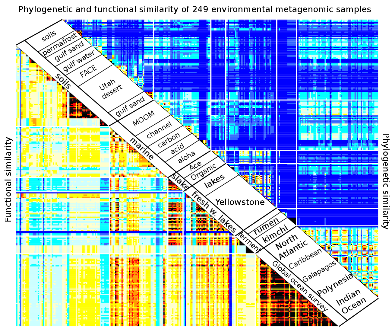
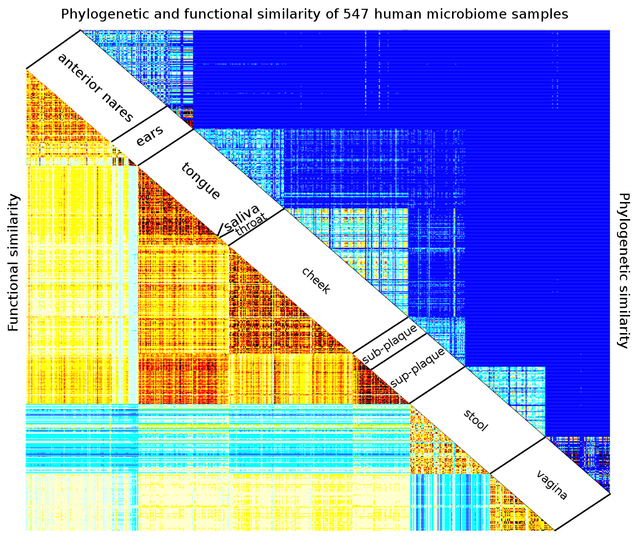
The correlation between the profiles (normalized dot-product) allows for the visual display of how close profiles within a cluster and profiles in other clusters, are.::
#-----------------------------------------------------
#  inner product matrix

rprofil2.phylo <- as.matrix(rprofile.phylo[,idx.sort])
dD <- t(rprofil2.phylo) %*% rprofil2.phylo
nd <- apply(rprofil2.phylo,2,FUN=function(x) sqrt(sum(x^2)))
cC <- dD/outer(nd,nd,FUN="*")

brks <- seq(-1,1,length=20)

image(1:sum(keep),1:sum(keep),cC,xlab="",ylab="",
   breaks=brks,
   col=heat.colors(19))
abline(v=clust.boundary+0.5)
abline(h=clust.boundary+0.5)
abline(c(0,1))
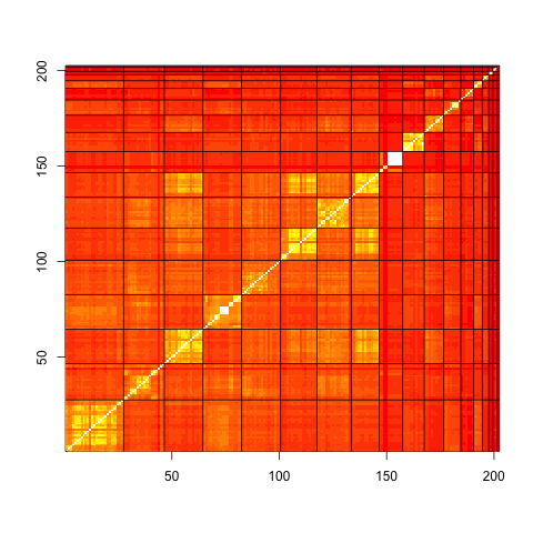
Distance between profiles, grouped in clusters.
8.6. Visualizing the clusters with R
Principal Component Analysis is a useful statistical tool for dimensionality reduction. The two first eigenvectors are the two orthogonal directions of largest variation, and provide a basis to produce 2d plots of our 402 dimensional profiles. It is instructive to color the each profile by its cluster id. In addition, each point can be given a colored halo corresponding to its environmental type. Such a plot can help display the clusters and may help with the interpretation.::
#-----------------------------------------------------
#  exploratory data analysis with principal component

PC <- prcomp(t(rprofile.phylo),center=F)
rC <- kmr.phylo$center %*% PC$rotation

#  look at what the clustering returns
#  and compare it with the labels

set.seed(321)
ccol <-  sample(rainbow(n.cluster))
ccol2 <- sample(rainbow(length(table(label1))))
names(ccol2) <- names(table(label1))

par(mfrow=c(1,1))
plot(PC$x[,1],PC$x[,2],xlab="pc1",ylab="pc2",
    col=ccol[idx0],pch=20,cex=0.75)
points(rC[,1],rC[,2],col=ccol,pch=18,cex=1.5)
points(PC$x[,1],PC$x[,2],col=ccol2[label1],cex=1.25,lwd=2)
legend(-0.35,-0.2,names(ccol2),col=ccol2,pch=1)
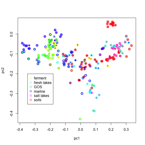
Environmental samples dispersed by first two principal components, colored by cluster.
It can be useful to look at similar plots for a few more eigenvectors.
The following R script script does just
that.
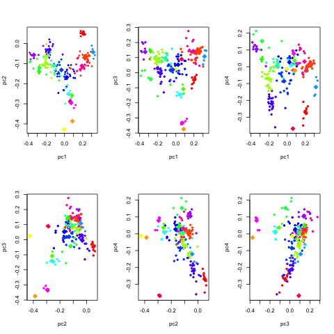
Environmental samples dispersed by next several components, colored by cluster.
8.7. Niche determinants, gulf oil